Table of content :
1. Always opt for a vertical content
2. Use the grid layout to your advantage
3. Figure out your brand’s aesthetic
4. Select brand-specific fonts, colors, and filters
5. Add borders to create visual interest
6. Follow Instagram’s recommended sizing and dimensions
7. Rearrange and reconstruct your feed according to your needs
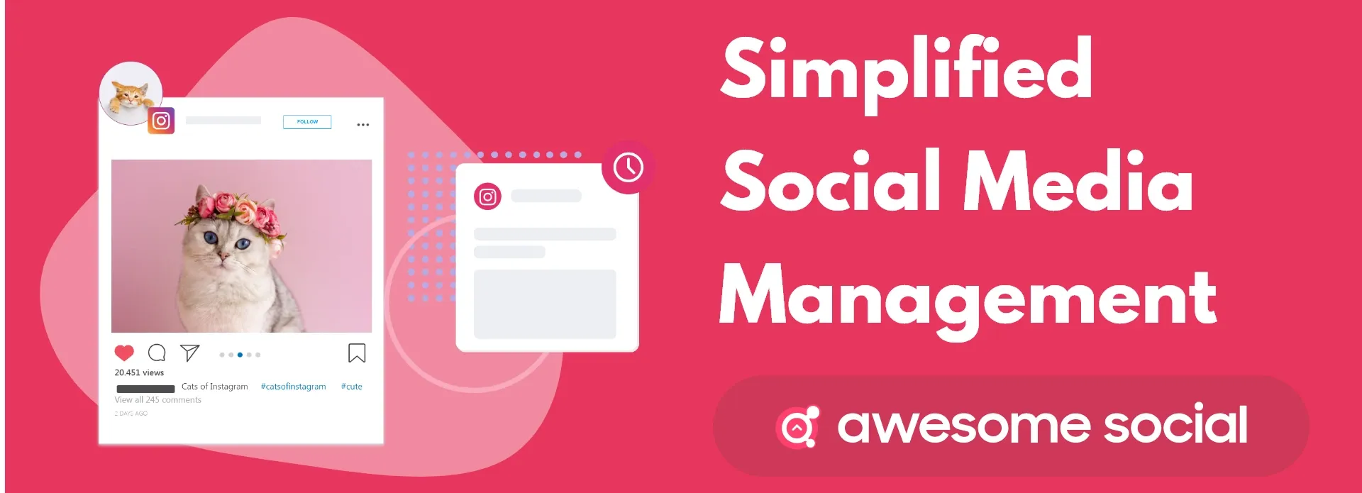
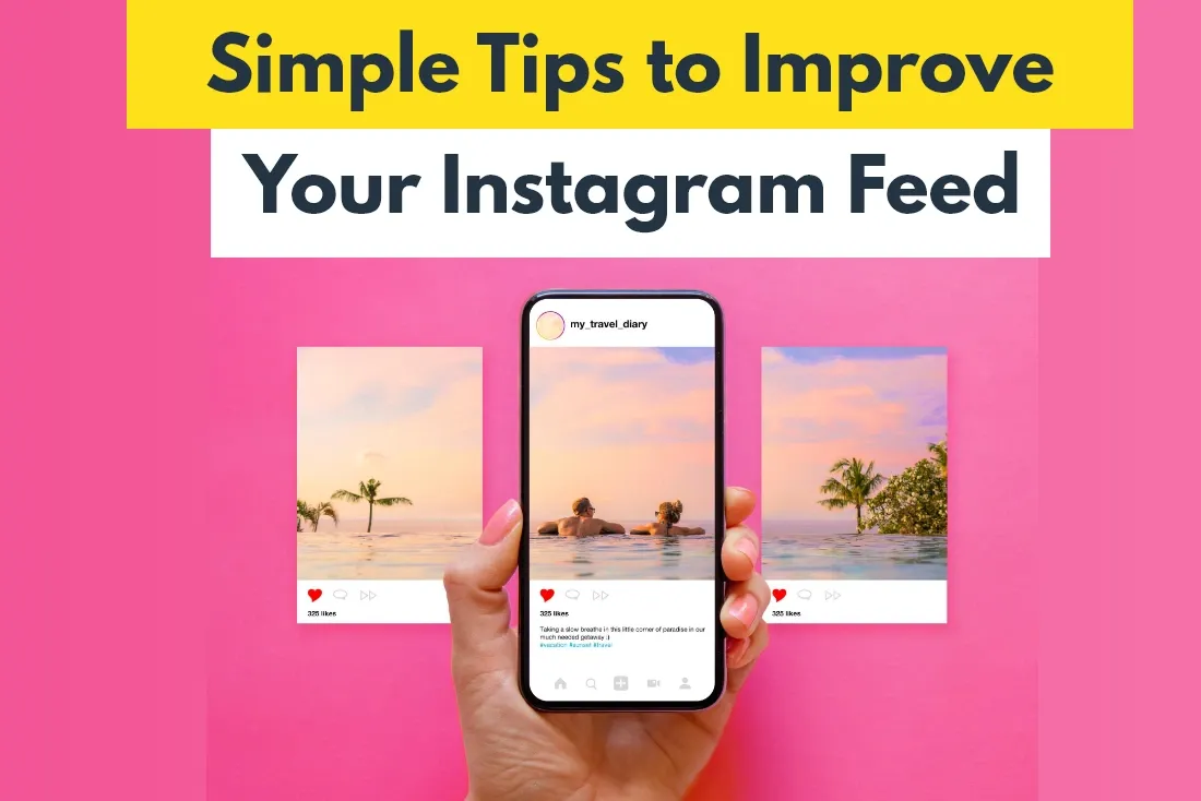
7 Simple Tips to Improve Your Instagram Feed

Awesome Social
Published on:
June 4 , 2023
·7 min read
My guess is a feed full of stunning visuals, from friends and the brands you follow. Personal accounts tend to be a mishmash of different pictures of a person’s lived experiences. But brands curate content that is meant to draw in stray visitors to their page. Aesthetics are everything on an app like Instagram. Your brand’s success depends on your ability to illustrate a story for people viewing your content.
These are 10 effective methods for visually optimizing your Instagram feed right away. In this post, we’ll explore some of the easiest ways to create a visually appealing Instagram feed. By visually appealing, I mean a cohesive aesthetic. Visitors are more inclined to like your images, follow you, and return for more if your feed seems appealing overall. I cannot emphasize the importance of finding your aesthetic identity as a business owner. Your feed represents your brand's identity and the representative body of your company. That's precisely why it is critical to get it right.
1. Always opt for a vertical content
The first and most obvious step towards creating visually appealing content on the gram is to create content for the vertical format type it features.
The vertical video format is a type of video representation that uses portrait rather than landscape mode. To put this into perspective, most Youtube videos are directed and produced in landscape mode, but TikTok videos and Instagram stories are filmed and edited in portrait mode. Vertical video appeal is a comparatively new trend in the social media advertising world. Because of its use in apps like Snapchat, Instagram, Facebook, and, most recently, TikTok, it has just lately become mainstream.
According to one survey, mobile accounts for more than 75% of video consumption, thus the emergence of vertical video isn't entirely unexpected. Also, around 94 percent of mobile users hold their devices vertically. There's nothing wrong with recycling existing creative assets for IG Stories if you're just starting started.
Instagram will automatically optimize current content for the Stories medium if you want to place Stories advertisements. However, if you organize and film your Stories footage in a vertical orientation from the start, you'll get improved returns. The best part is that you don't need to go all out. Because brand-shot Stories from mobile appear very much like the content that ordinary users share. So whenever your film or shoot your next Story, ensure it suits the vertical orientation.
2. Use the grid layout to your advantage
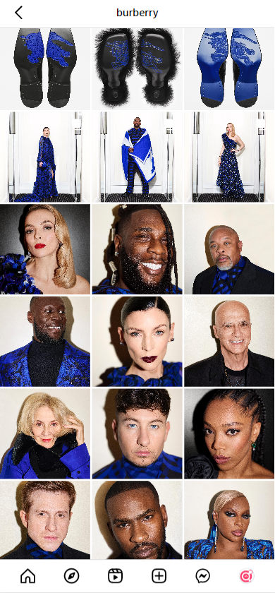
When users first visit an account, the first five rows of posts stand out instantly. These five rows fit into every modern smartphone screen almost exactly and are the first impression your content will create in the mind of visitors and followers. Your posts are displayed in your feed using a grid framework. It assists you in determining which photo to place next to another. A layout makes it simple to begin and maintain a cohesive Instagram aesthetic.
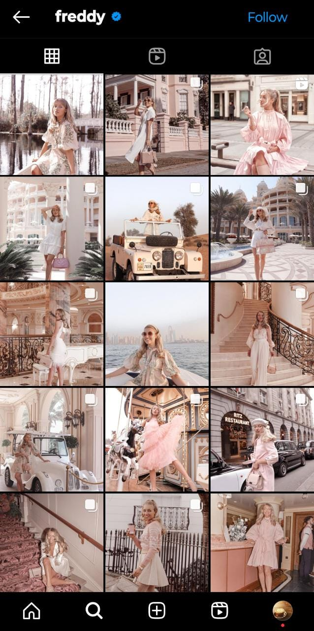
For example, in the photos below, you can see a clear theme and cohesive aesthetic in the brand’s grid.
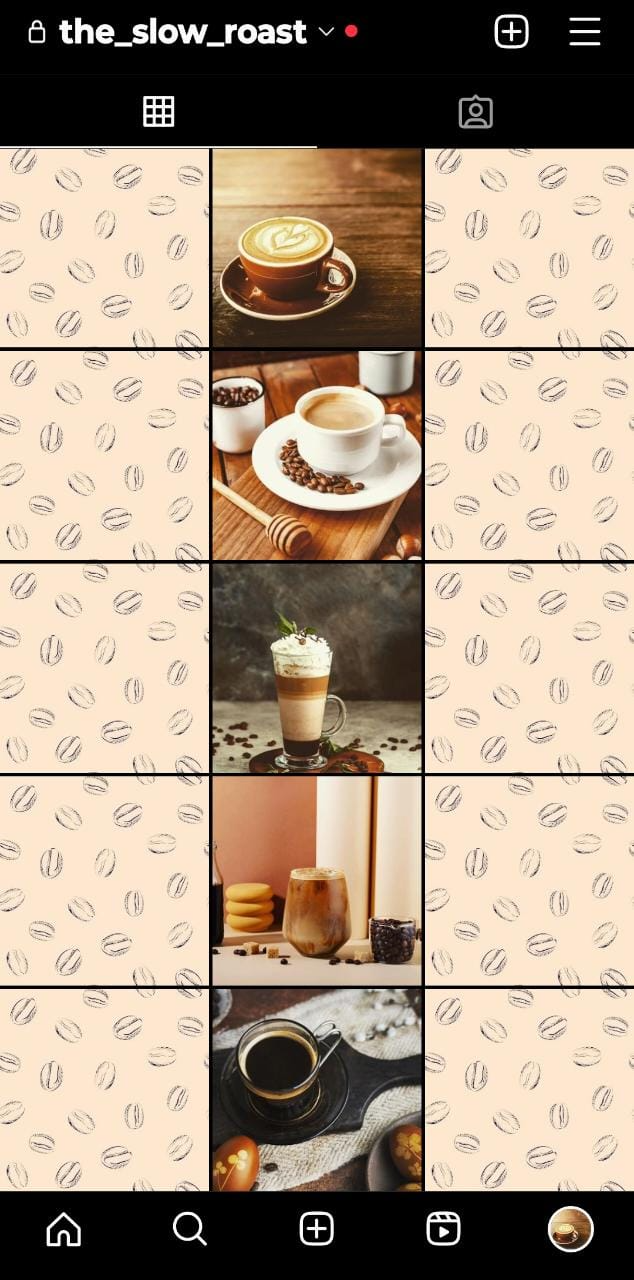
This cohesion immediately cements the image of the brand and its identity as a business selling coffee or coffee-related goods. Moreover, it illustrates the thought put into creating a visually symmetrical and color-specific feed.

3. Figure out your brand’s aesthetic
An Instagram theme is the overall appearance of your Instagram feed. It represents your visual personality. So, what is your preferred theme? Rustic, soulful, eclectic, tropical, bright, minimalistic, or maximalist? Your chosen aesthetic will assist you to attract people who share your brand's tastes and preferences, making them the ideal potential client. Your aesthetic is also an excellent means of communicating your brand's mission and identity. This method is particularly effective if your brand is aesthetically focused.
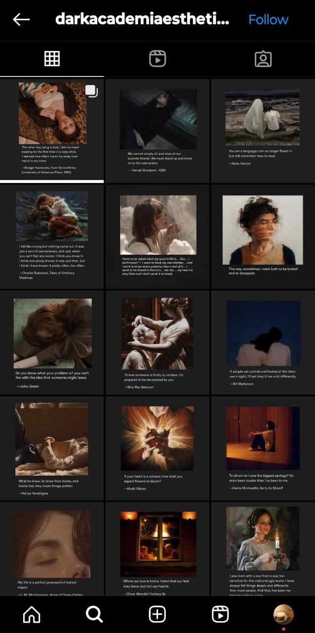
All the accounts displayed above have a clear aesthetic identity. Choosing an aesthetic can feel daunting as if someone loves a certain vibe or theme, that also means there’s a high chance someone else will dislike the exact same thing. But this shouldn’t stop you from choosing an identity that resonates with your brand, as ultimately, all potential clients will likely enjoy your products for the aesthetic aspects of it as well as their functional or practical aspect.
4. Select brand-specific fonts, colors, and filters
Instagram offers several in-app filters that you can pick and choose from to help create a cohesive brand presence. But you can also find similar filters on different editing apps or you can create a filter of your own that emphasizes your brand’s appeal. But going without a specific filter for at least a short period of time can make your feed appear messy. A great way of choosing a filter is to go with your brand’s color palette. If your brand colors are jewel tones, filters that make these jewel tones pop will be a great choice. If your brand is more minimal and has a lot of white space, earthy or neutral filters would be the way to go.
Picking a filter doesn’t mean you have to stick with it forever though, you can choose varied filters with similar color stories and create the same effect. But, if possible, try to keep the first five rows looking as cohesive as possible as it is the first impression your brand creates. This is why pre-planning and scheduling content to fit the Instagram grid is essential to maintaining consistent high-quality and curated content.
5. Add borders to create visual interest
Borders are fantastic. They create great white space between your photographs. They allow your feed to flow more naturally. They are ideal for capturing a variety of subjects in a range of colors. These are a great way to make your feed look consistent without putting in too much work. Yet, occasionally you might get carried away and wind up utilizing a slew of various borders on your images. It can occasionally work out and look beautiful. However, sometimes things don't work out. Your feed may wind up appearing chaotic. So, when uploading on Instagram, attempt to utilize the same border for at least five rows, which is the grid pattern. It quickly makes your feed look sleek and sophisticated.
6. Follow Instagram’s recommended sizing and dimensions
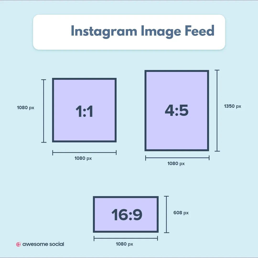
Instagram’s visual nature makes it all the more vital to know the dimensions of feed posts, reels, and more when marketing, on the app. Instagram feed posts can be portraits, squares, or landscapes. In the feed, each image will be condensed to a square. Posts should be 1080 pixels wide by 1080 pixels high with a 1:1 aspect ratio. Use a photo with an aspect ratio of 1.91:1 which is 1080 pixels by 566 pixels for landscape posts. Vertical photos should have a 4:5 aspect ratio and be 1080 pixels by 1350 pixels in size.
The standard for all static feed posts is a 4:5 ratio, or 1080 x 1350 pixels, with the most significant text and images in the middle square. Any visual, photo or graphic falls under this sizing when on the Feed. It's essential to know that some users have already started using this format for their posts, and numerous Instagram experts have recommended it. Feed posts must be these sizes because, unlike Stories that disappear, feed posts are permanent. A low-quality Story isn't too much of an issue, but a low-quality feed post damages your overall aesthetic and brand image.
For full detail on Instagram Post size, Read this article
7. Rearrange and reconstruct your feed according to your needs
By now, you already have a clear grid in mind. You are aware of the overarching aesthetic you want to represent as well as the required dimensions for each image. Moreover, you have a filter that aids in preserving uniformity throughout the feed. Making things flow naturally is the final step. The secret is to rearrange the sequence of your content such that your feed flows cohesively.
Trying to predict which photographs to publish to make your feed flow as a whole can be challenging. For this reason, you do need to use an app like Awesome Social that makes it easier for you to picture your future feed with a similar grid style.
Take your time moving your photographs around until you're satisfied with the overall appearance of your feed. Spread out your images based on the colors in them, or even the subject or setting, to enhance the appearance of your feed. People generally avoid placing photographs that are too alike in close proximity to one another. They build variety between every post by spreading out images that appear overly alike. This will make your feed appear more streamlined.
And there you have it: 7 classic ideas to grow your Instagram following in 2023.
Try using these suggestions the next time you're structuring and creating your content for the platform and watch your engagement and following grow!